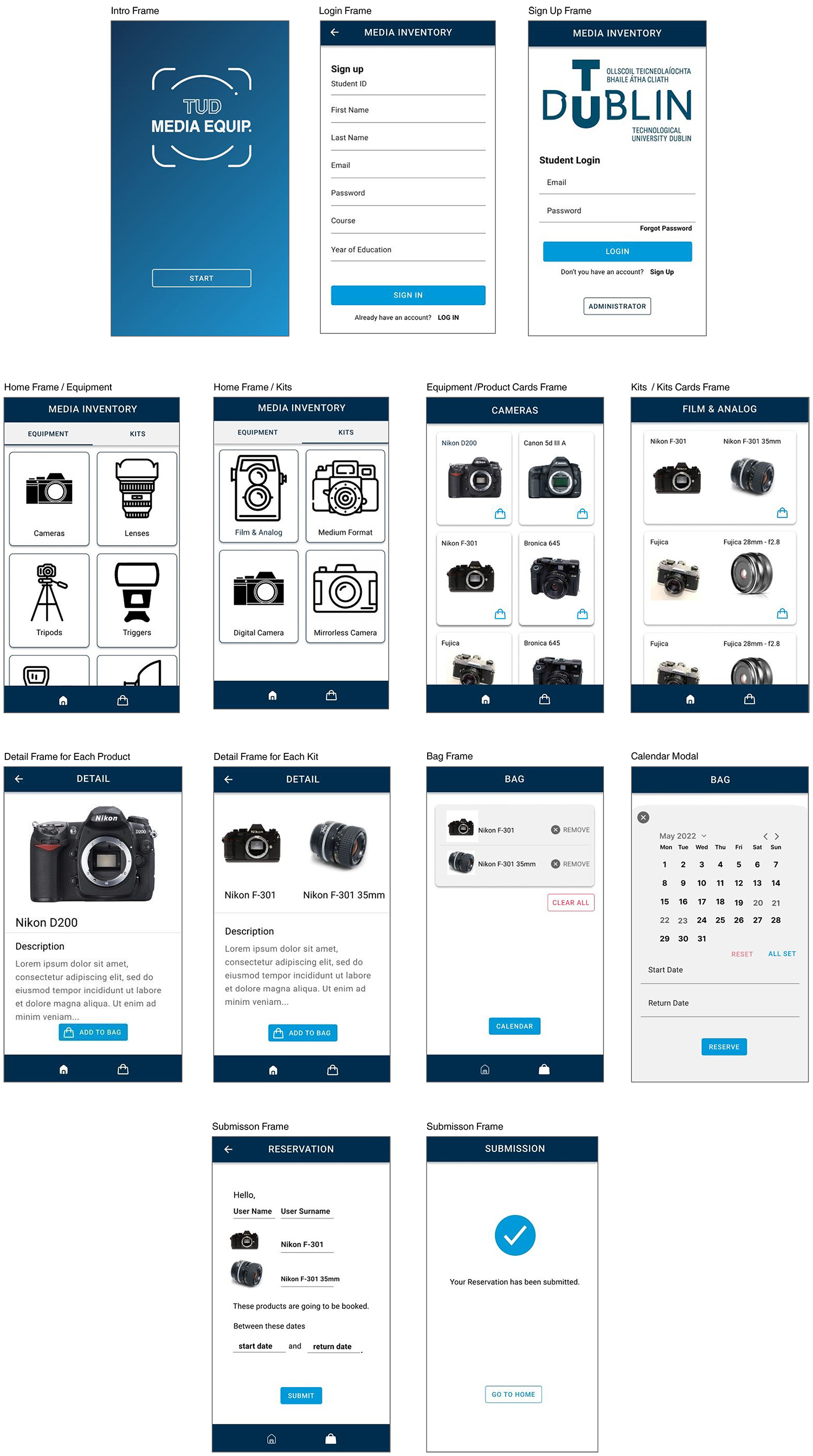
MEDIA EQUIP

Project Overview

This project was created for the inventory room of Technological University Dublin that students borrow and lend some media equipment. The aim of the app is to facilate this operation between administrator and students.

My Role

Sole UX/UI and Development

Tools

Figma, Visual Studio Code,Ionic Framework, Angular, MYSQL

Timeline

6 months

User Research

A mixed-methods approach was utilized, combining qualitative and quantitative research techniques to gather comprehensive insights.

Qualitative Research

Interview with Administrator

1 person:
Administrator

35 minutes

10 questions

This interview was made with the administrator who was responsible for the inventory room. The interview took 35 minutes nearly. Almost 10 questions were asked. The questions were separated into three sections. Due to this interview, some valuable data was acquired in order to implement these objectives on the application.

Insight

Objectives

  1. Time Management: Ensure equipment is returned on schedule to keep availability high.
  2. Process Control: Maintain oversight of borrowing and returning to reduce delays.
  3. Prioritization: Allocate resources based on students’ levels and module requirements.
  4. Efficient Organization: Bundle multiple items into ready-to-use kits for smoother access.
  5. Clear Communication: Provide upfront information to help students navigate restrictions and manage expectations.
Survey with students

7 students

35 minutes

5 questions

Due to this interview, some data regarding the students' expectations and struggle while borrowing some equipment were valuable data to indicate what feature should be part of the App.

Insight

Project Insights

  • Accessibility:Ability to browse equipment online before visiting.
  • Process Control: Desire for a smoother borrowing and return flow.
  • Organization: Clear categorization of products (e.g., camera types, pre-made kits).
  • Availability:Real-time visibility into what equipment is in stock.

User Persona

User personas are based on the initial user survey, and are separated into two sections, which are general users who study photography and filming generally, and another section studying other fields.

General Users
User Persona 1
Other Users
User Persona 2

Affinity Diagram

To be identified technical relationships between products, user preferences, and frequent actions based on qualitative data gathered from interviews with students and administrators, as well as surveys.

Insight

Discoveries

  • What is the camera equipment?
  • What are the types of cameras?
  • Are they compatible with other products?
  • What if some of them are compatible, how is it presented in terms of the terminology and the user's needs?
Affinity Diagram

Ideation

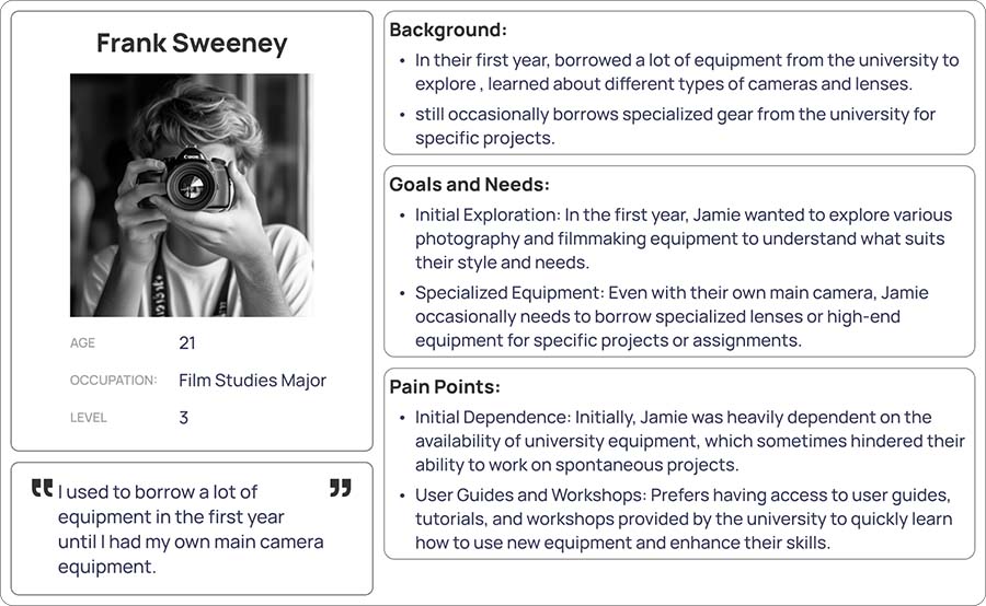
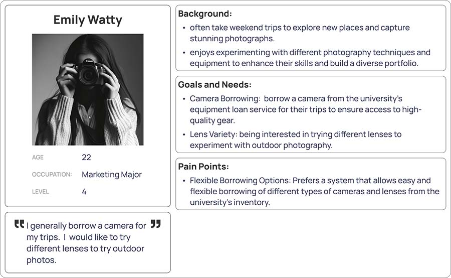
In the ideation phase of my project, I used the user story mapping method to explore the user's journey in detail. By breaking down the user's interactions step by step, I was able to identify key needs, pain points, and opportunities for improvement. This process allowed me to generate concepts that directly address the user's core challenges, ensuring that the final design is not only functional but deeply aligned with their expectations and goals.
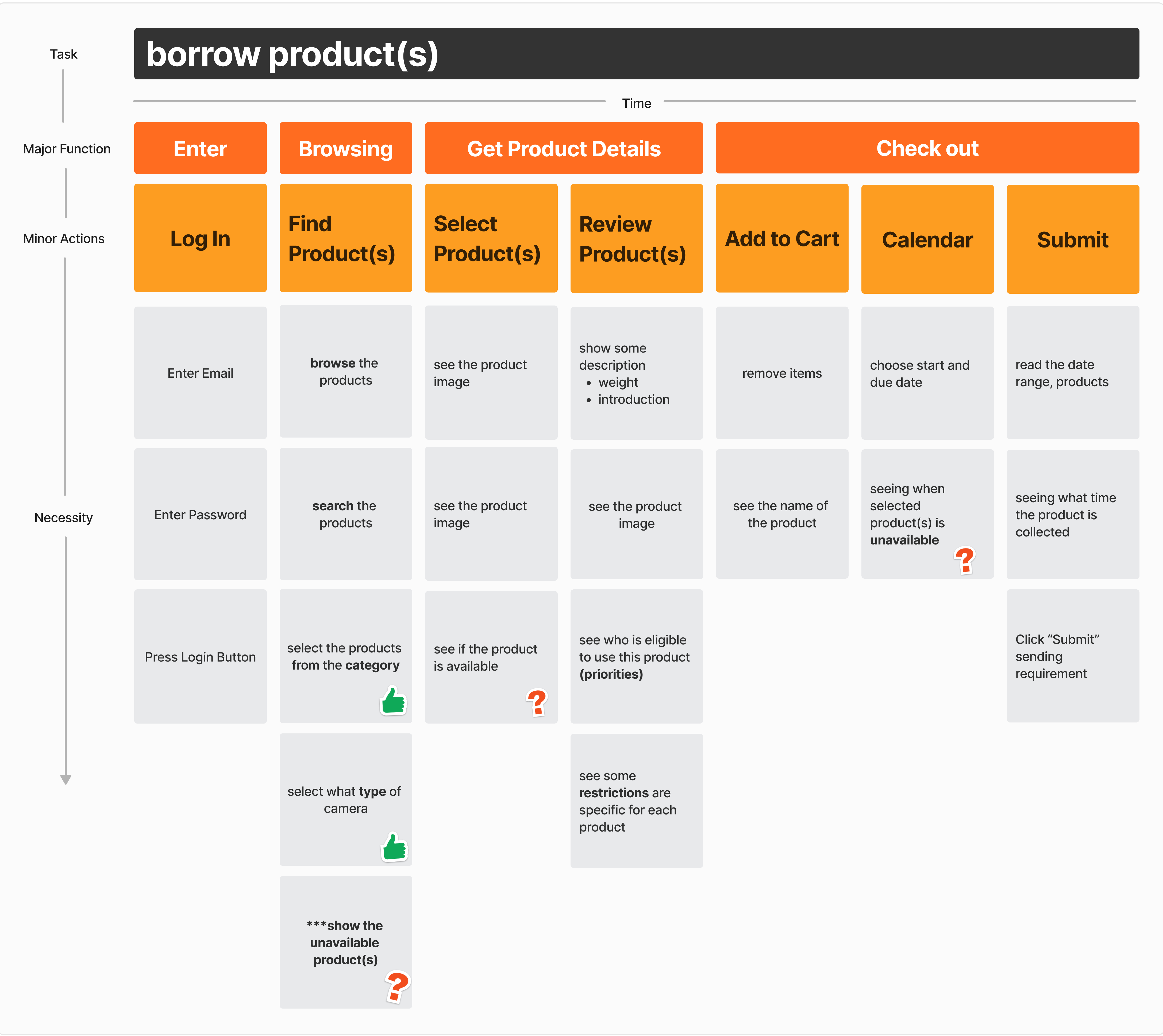
User Story Map

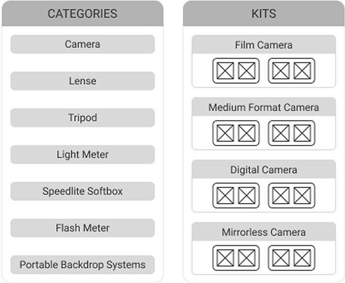
The user story map, which aligns user needs with product features, was used in order to deliver the most valuable features first.
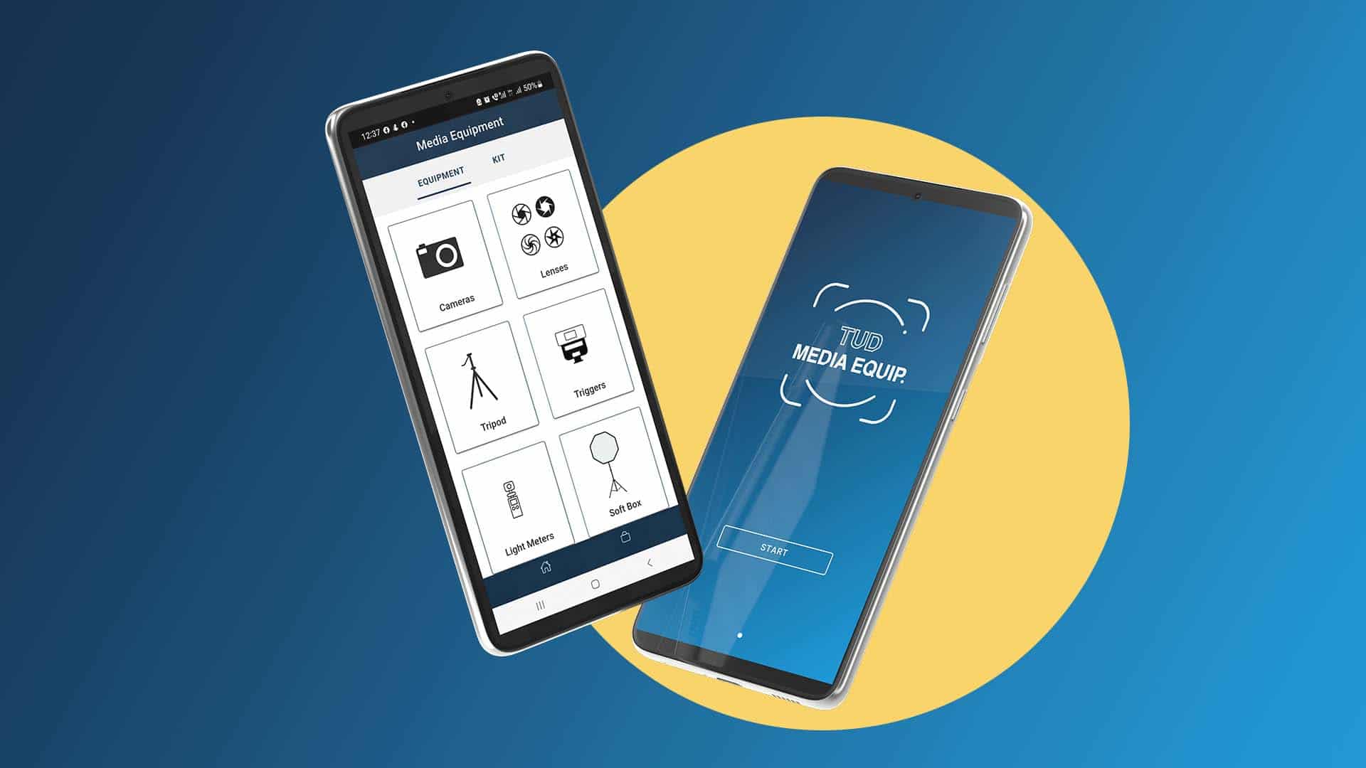
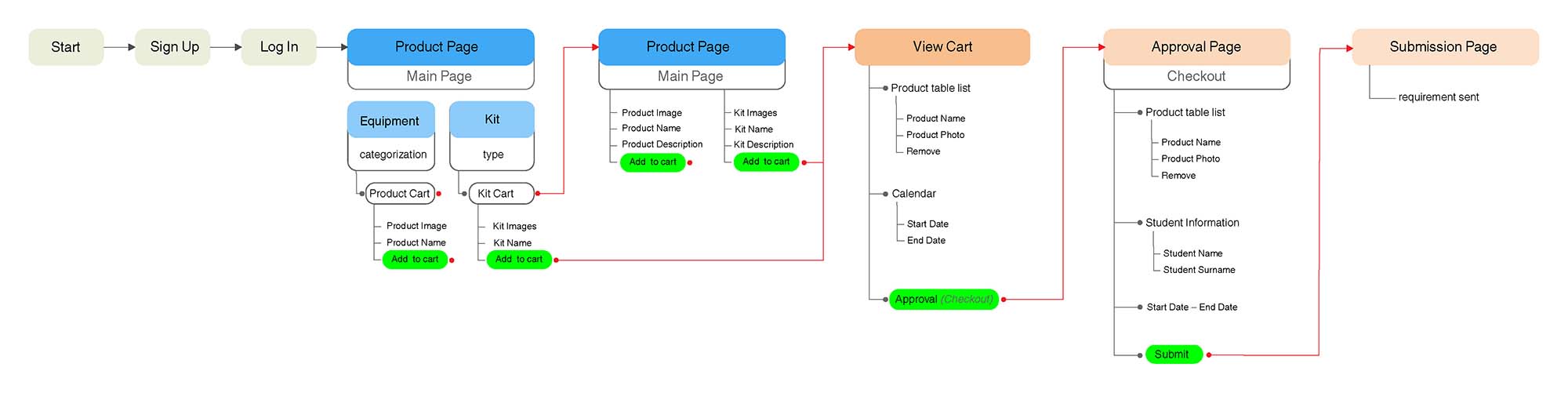
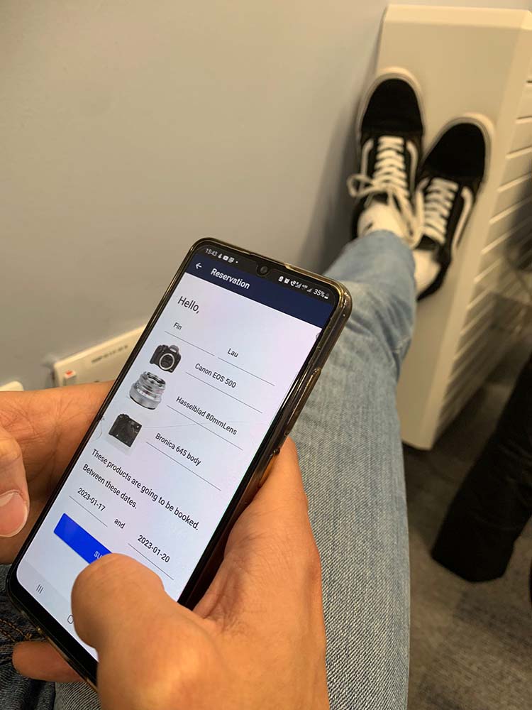
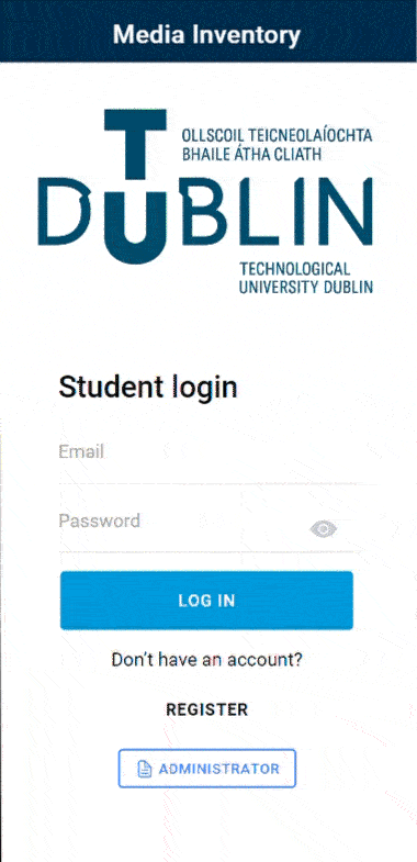
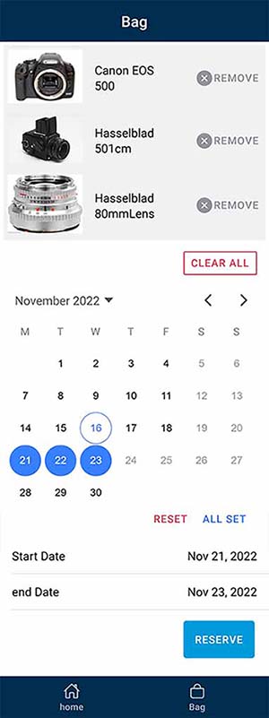
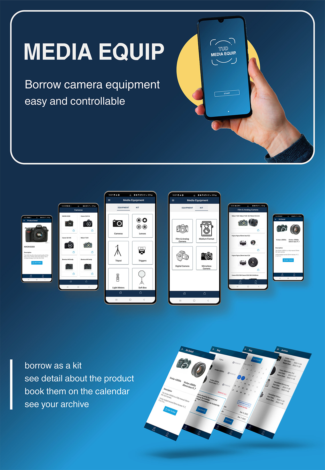
The initial task of the students, who are the users, is to borrow some equipment from the inventory room, which is the backbone of the user story map. Then, the major functions were broken into minor actions to complete the initial task on the map.

Insight

Discoveries

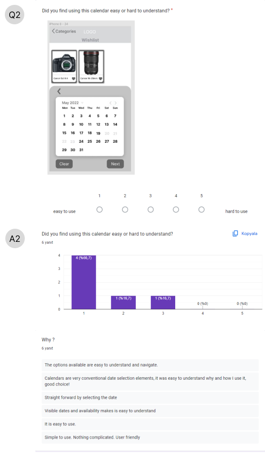
  • It is important to consider how to display availability status of the products.
  • When and how to show the availability what if the users want to borrow more than one product?
Affinity Diagram

User Flow

Design · UX Concept and Wireframing

Low-Fidelity Wireframe

By making low-fi wireframes and reconsidering how effectively the affinity diagram could be utilized on the application, the mid-fi wireframe was created according to user flow. One of the important factors is presenting categories and kits. The way of implementing the segment component was considered on the home frame. The aim is to make the navigation easy and interface that works for the user's expects.

Testing Session 1

These answers were based on the mid-fidelity prototype as feedback. I did a survey to gather some feedback in order to measure their experience while using the mid-fidelity prototype.
The users found the application easy to use. They generally did not have any difficulties navigating one frame to another. In particular, I asked them to use the calendar to interpretion between selected products and the calendar. According to the result, it was observed that the approach of using it was familiar with other applications.

Testing Session 1-Survey

Total 6 partipicant

UI Concept

After researching TUD website and other applications such as TUD Sport, I revised the logo of TUD in order to use it on the Icon of the application. The aim is to make the application associated with TUD. Therefore, carrying the same corporate identity for the application is significant. For that reason, choosing colour schema for the application should have a similar concept approach as same as TUD.

Testing Session 2

This part is divided into two sections. The first focuses on observing users as they interact with the app, while the second covers meetings with my supervisor to enhance the application's cohesiveness, refine the UI design, ensure appropriate use of terminology, and create a more user-friendly experience.

DECISION

Observation

  • When they took action in particular what feedback the application make the user assured about their tasks.
  • Confirmation Feedback

Meeting with My Supervisor

During the meeting with my supervisor, the proper way of choosing the words was discussed since e-commerce applications were examined to be used for some sections at the beginning of the design for the application. I present the last updated high-fidelity prototype after all the valuable feedback from this session that improved the applications.

DECISION

Observation

  • When they took action in particular what feedback the application make the user assured about their tasks.
  • Confirmation Feedback

High Fidelity Wireframe

Delivery · Development

The application was developed on the Android platform, primarily because my laptop runs on a Windows system, which aligns well with Android development tools.
To create a hybrid application, I used the Ionic framework within a Node.js environment. This approach allowed for the use of web technologies like HTML, CSS, and TypeScript, as opposed to developing a purely native application.
The database architecture was built using MySQL tables. To create the REST API, I wrote PHP scripts that handle data by receiving, extracting, and inserting it into arrays, enabling seamless communication with the database.
For handling API data within the application, the Angular platform was utilized, leveraging its directives to iterate over objects from the API.
Finally, Heroku was used to host the MySQL tables and PHP scripts, making them accessible outside of the local development environment.

Architecture of Database

Tables Overview:
  • Categories and Subcategories: These tables define the primary classification of products. Categories represent broad groups, while subcategories provide more specific classifications within each category.
  • Items Table: This table contains detailed information about each product. It links products to categories and subcategories through categoryid and subcategory_id fields.
    • Category and Subcategory Linkage:Category and Subcategory Linkage: Each product in the items table is associated with a categoryid and subcategory_id, indicating its classification. For example, a product with categoryid 3 might be categorized under lenses, while a categoryid 2 might denote cameras. The same logic applies to subcategory_id for finer classification.
    • Kit Identification: The `kitid` column in the `items` table designates products that can be combined into kits. Products sharing the same `kitid` number are grouped together, allowing users to borrow them as a set rather than individually.
    • Example:Products with a `kitid` of 17 are part of a specific kit. This system simplifies the borrowing process by enabling users to select an entire kit instead of choosing each item separately.
    Borrowing Table with the Application of the Calendar

    When the user submits what items (products) were borrowed, the data of the users, itemId, and start and end date are posted on the borrowing table.


    One of the important parts of this table is that it works based on ItemId of the borrowed items, which means that the data of the user iterates according to how many items were borrowed on the borrowing table.


    The startDate and endDate have a significant role in the connection with the calendar on the application.

    The calendar allows the users to choose a date range on which items (products) that the user wanted to borrow were available together, which means that the date range of items that had been borrowed before is blocked on the calendar. That is to say, those days overlap on the calendar, and this case leads the user to choose when all selected items were available together on the calendar.

    The Minimum Viable Product

    • Provided one prompt feedback converting the outline bag icon into a filled bag icon as visual feedback.
    • Presented toast text to display at the bottom of the screen at the same time.
    • Deployed Ionic Calendar

    Testing Session 3

    The APK was sent to users to test the application, and it was observed while they were using the application. The valuable findings of the testing session

    Impact

    Test Feedback

      Half of the users struggled with operating the calendar. The challenge arose because the Ionic Framework's calendar, which was used, didn’t include a date range picker template. This was the only available option that allowed users to select multiple days, presenting a significant constraint. To improve user understanding and ease of use, revisions to the calendar were made, taking into account possible changes to make it more intuitive.

    • Implement changes to improve the user interface based on feedback
    • Replace the term "Reset" with "Clear" or "Restart" for better clarity, and replace "All Set" with "Confirmed" or "Ready" to ensure users understand the finality of their actions.

    The Revised Minimum Viable Product

    • Added toast feedback with toggling of the bag icon.
    • Repeated the same feedback on the detail frame of the products and kits.
    • Hid the calendar to guide the users more accurately. Utilized information text about the calendar.
    • Changed some words to set the calendar. Those are "Confirm Dates" and "Clear" instead of "All Set" and "Reset".
    • Applied the side menu to display what kinds of products were borrowed before and current borrowing products.

    Poster

    Promo Video